Context
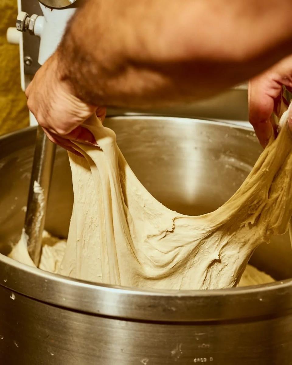
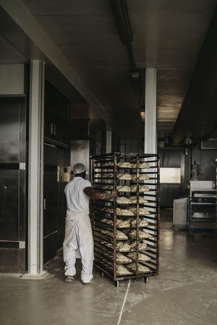
Forn Mirall has baked on the same corner since 1964. Four shops now, one oven room, the same sourdough starter. The shops had drifted apart: different awnings, three logos, bags printed by whoever was cheapest that year. Regulars knew it was one bakery. Nobody else did. The family wanted the shops to look like one place again without losing what each street had made of its own shop.
Insight
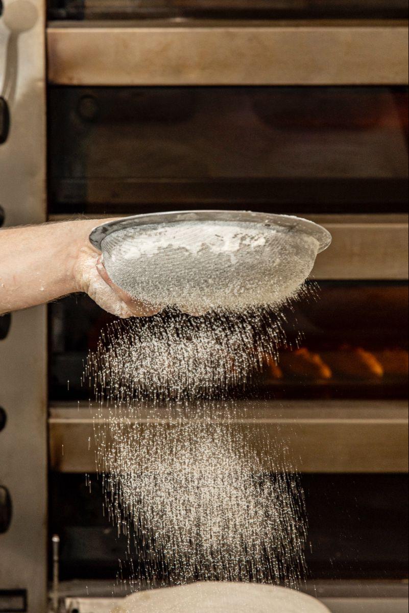
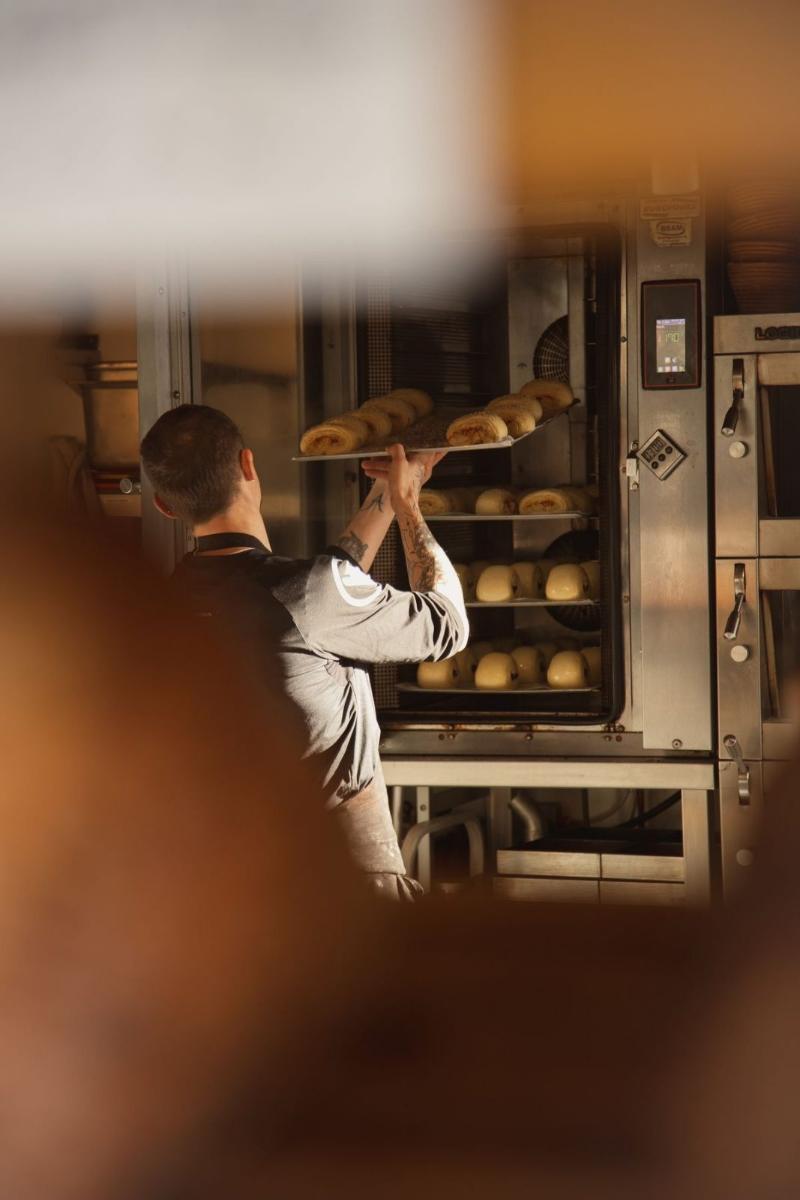
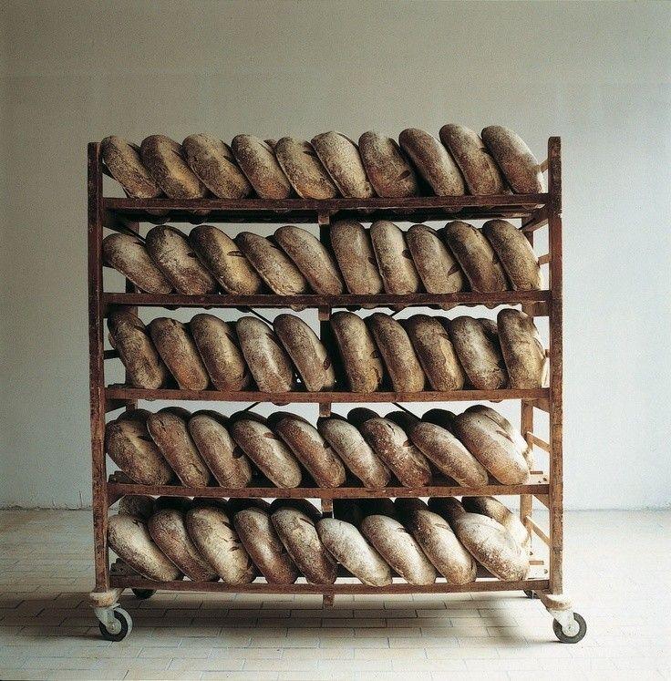
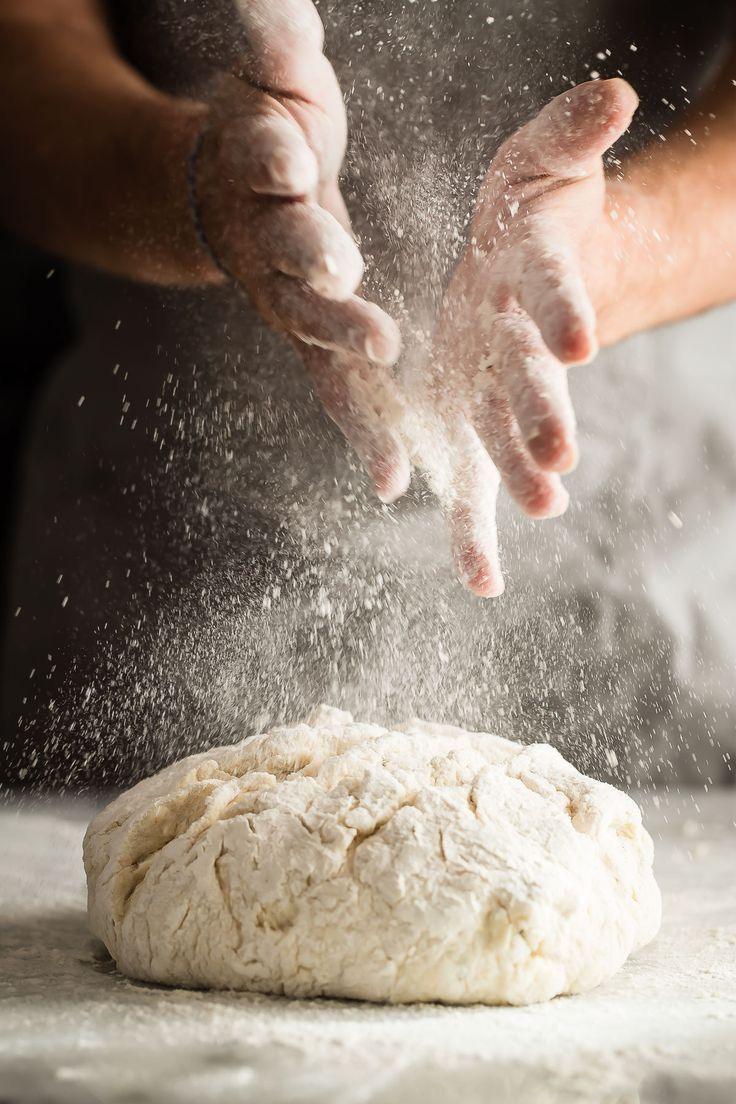
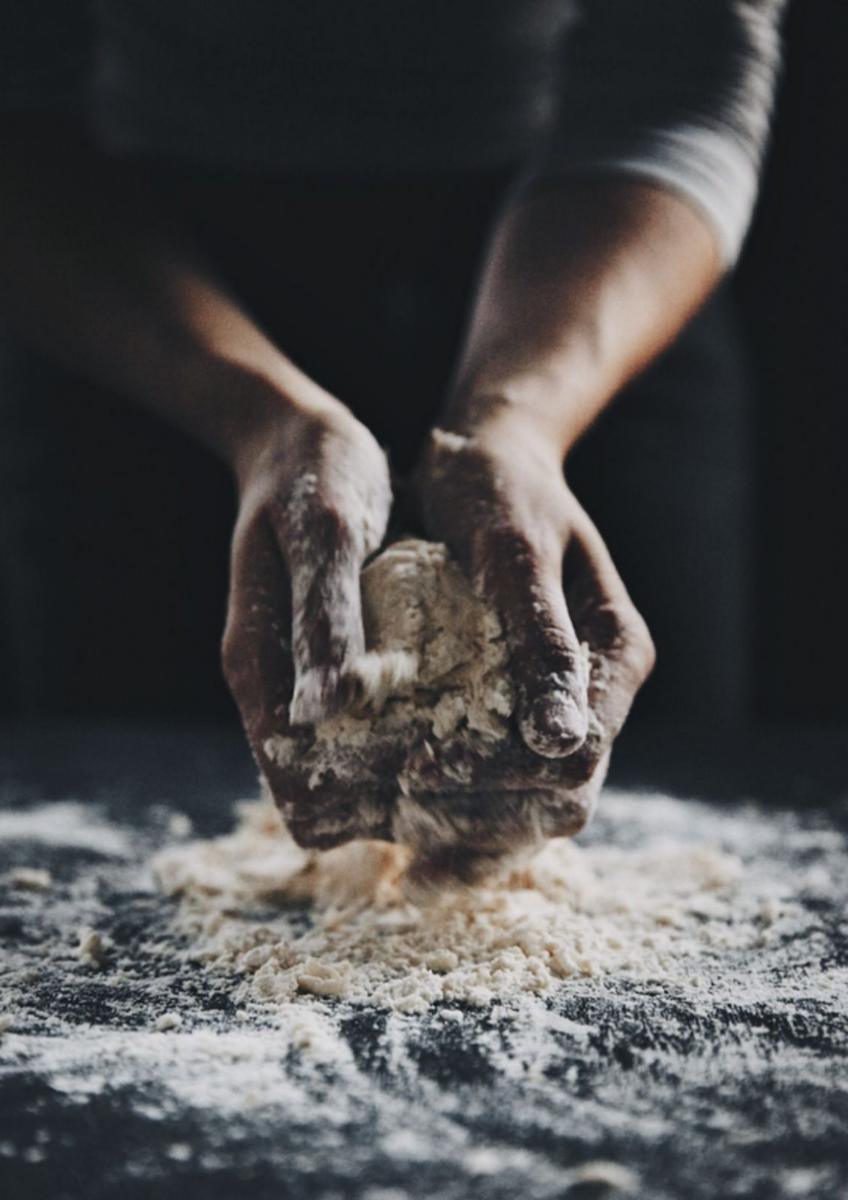
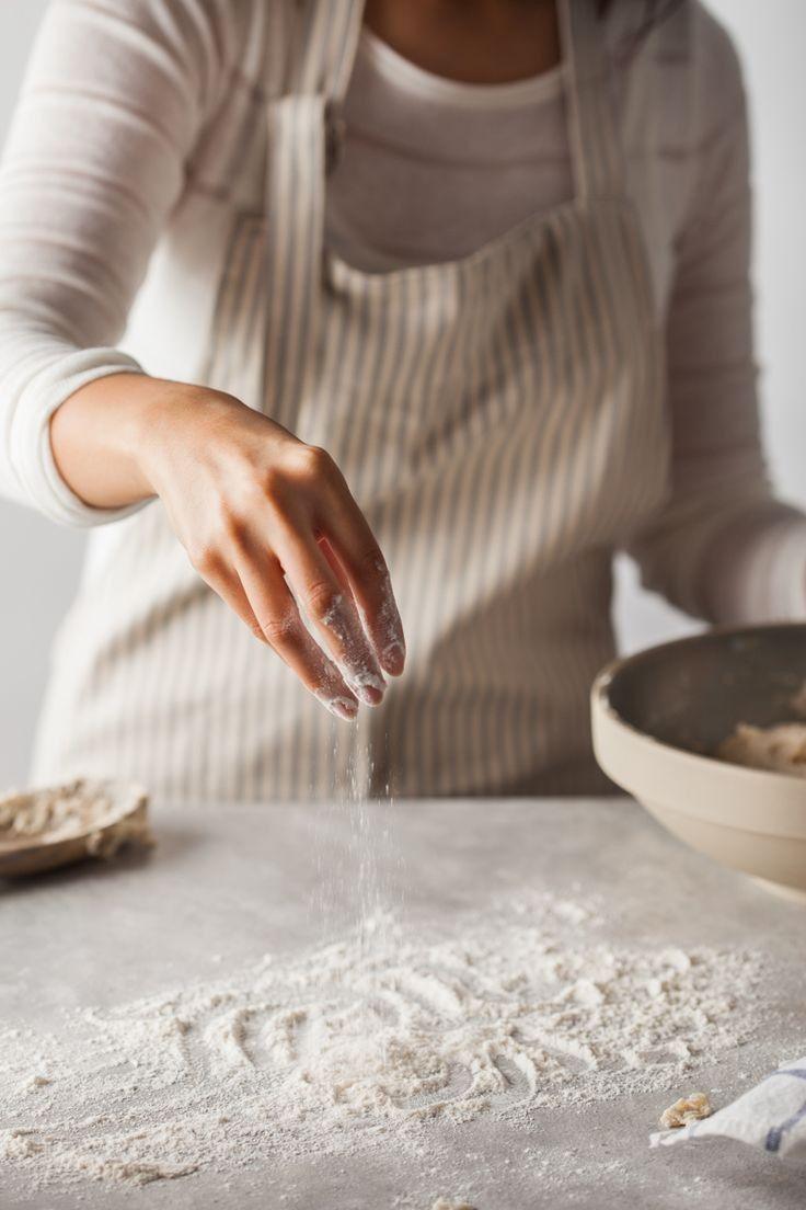
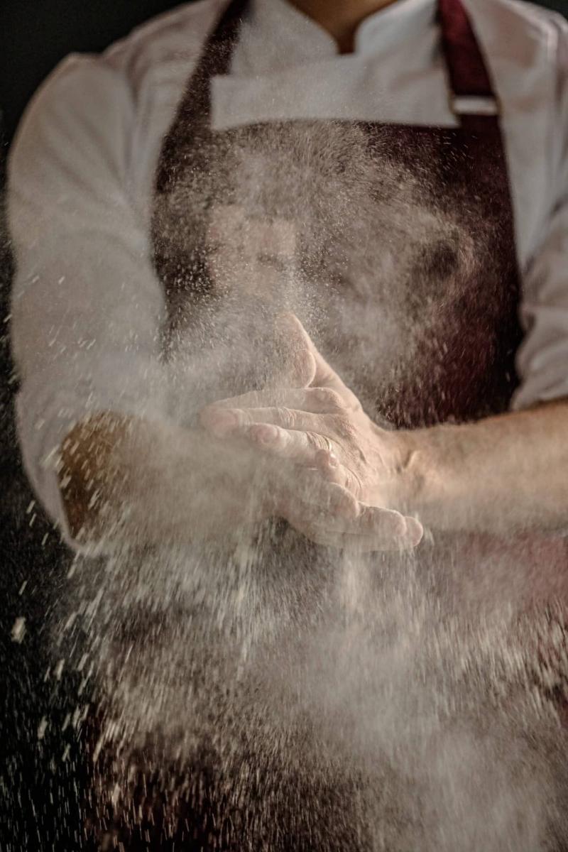
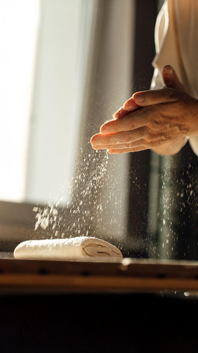
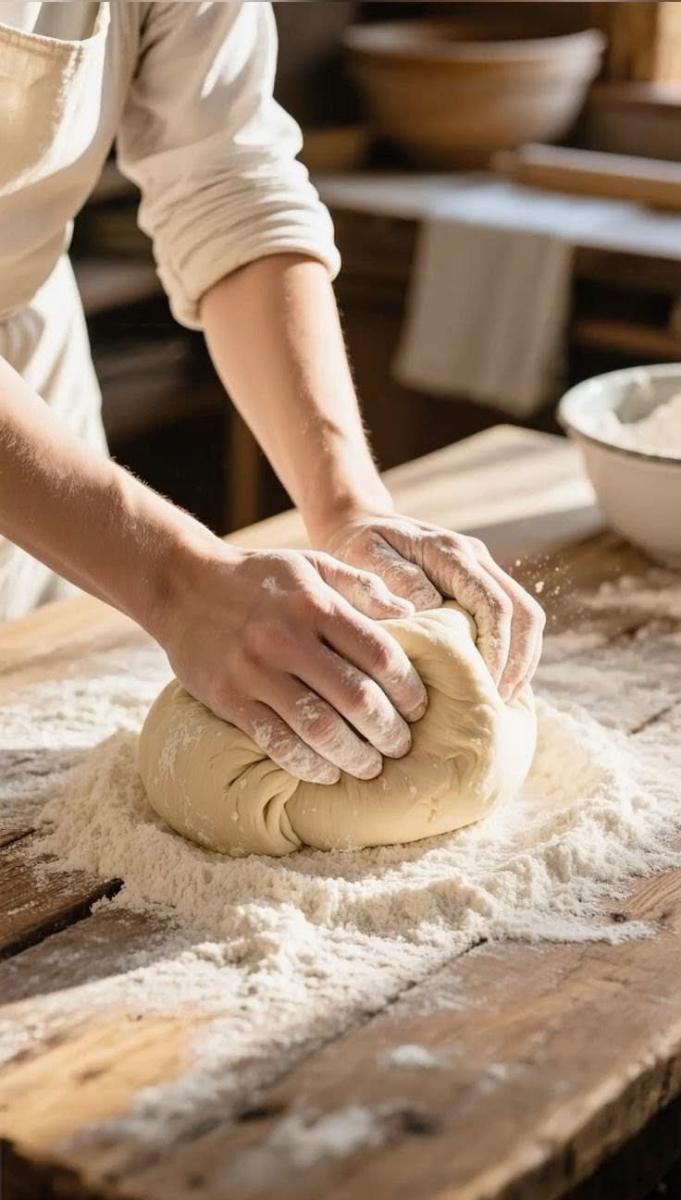
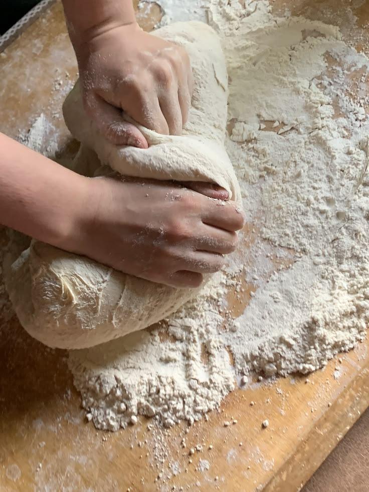
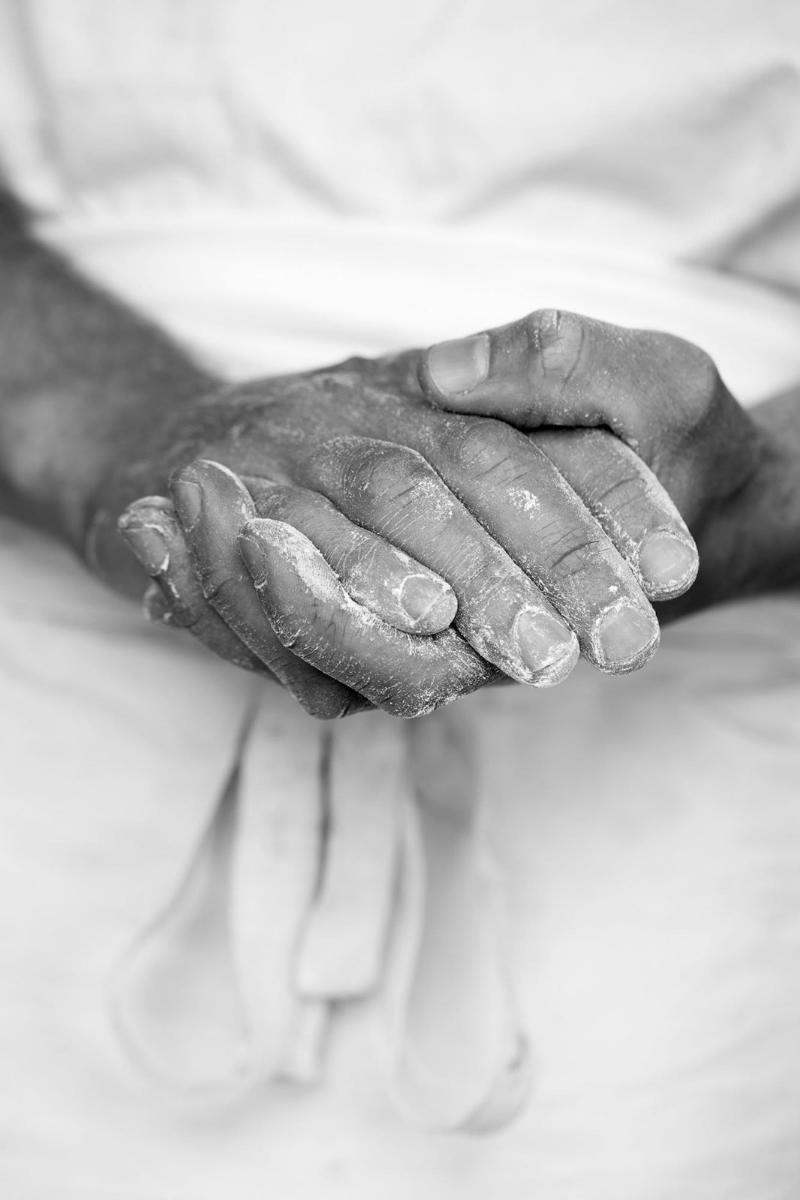
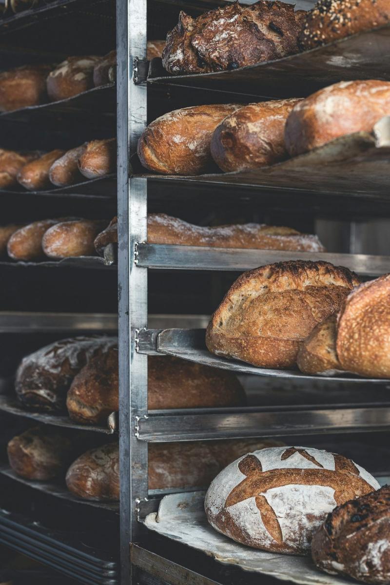
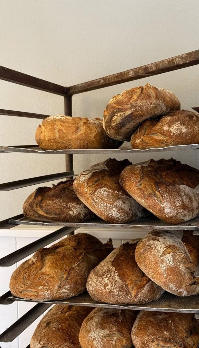
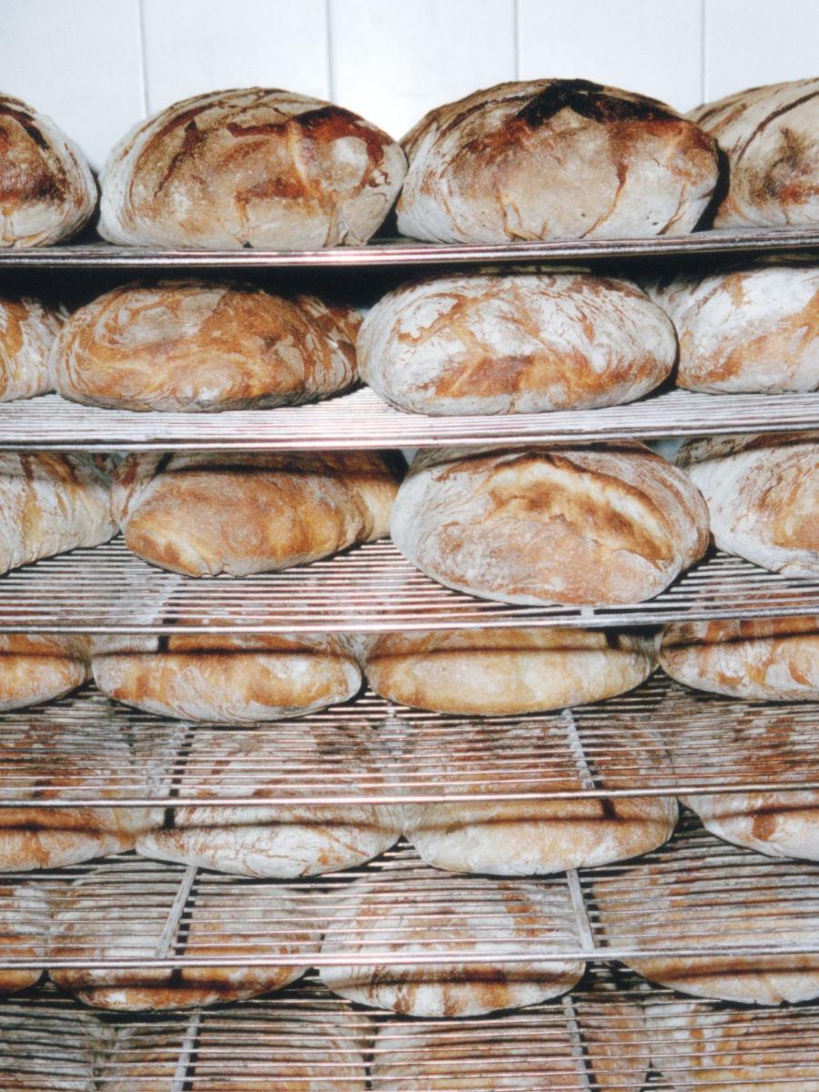
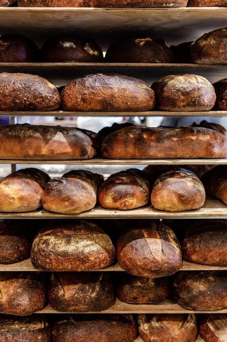
The only thing every shop shared was the flour on everything: the counters, the aprons, the bread itself. White with a warm cast, never pure. And behind it, the colour of each crust. The bakery already had a palette; it had just never been written down.
Idea
We built the identity from flour and crust. A warm off-white ground, and one crust colour per shop, sampled from its best seller. The wordmark is drawn from the hand-painted letters over the first door, cleaned up but kept uneven. Packaging uses the same two tones and a stamp, so the bakers can mark bags by hand.
Application
Shop fronts, awnings, paper bags, boxes, labels, price cards, uniforms and a stamp set for each counter. The four shops keep their own crust colour, so a regular can still tell which shop a bag came from, while everyone else sees one bakery.
Impact
All four shops were refitted over two Mondays, when the bakery is closed. The stamp set is still the most used part of the system.